



Casa de las Flores
Brand Identity · Art Direction
Boutique hotel in Lanzarote, Spain.
- Client
- Casa de las Flores
- Sector
- Hospitality · Boutique Hotel
- Location
- Lanzarote, Spain
- Services
- Brand Identity · Art Direction
- Link
- Instagram ↗
The Challenge
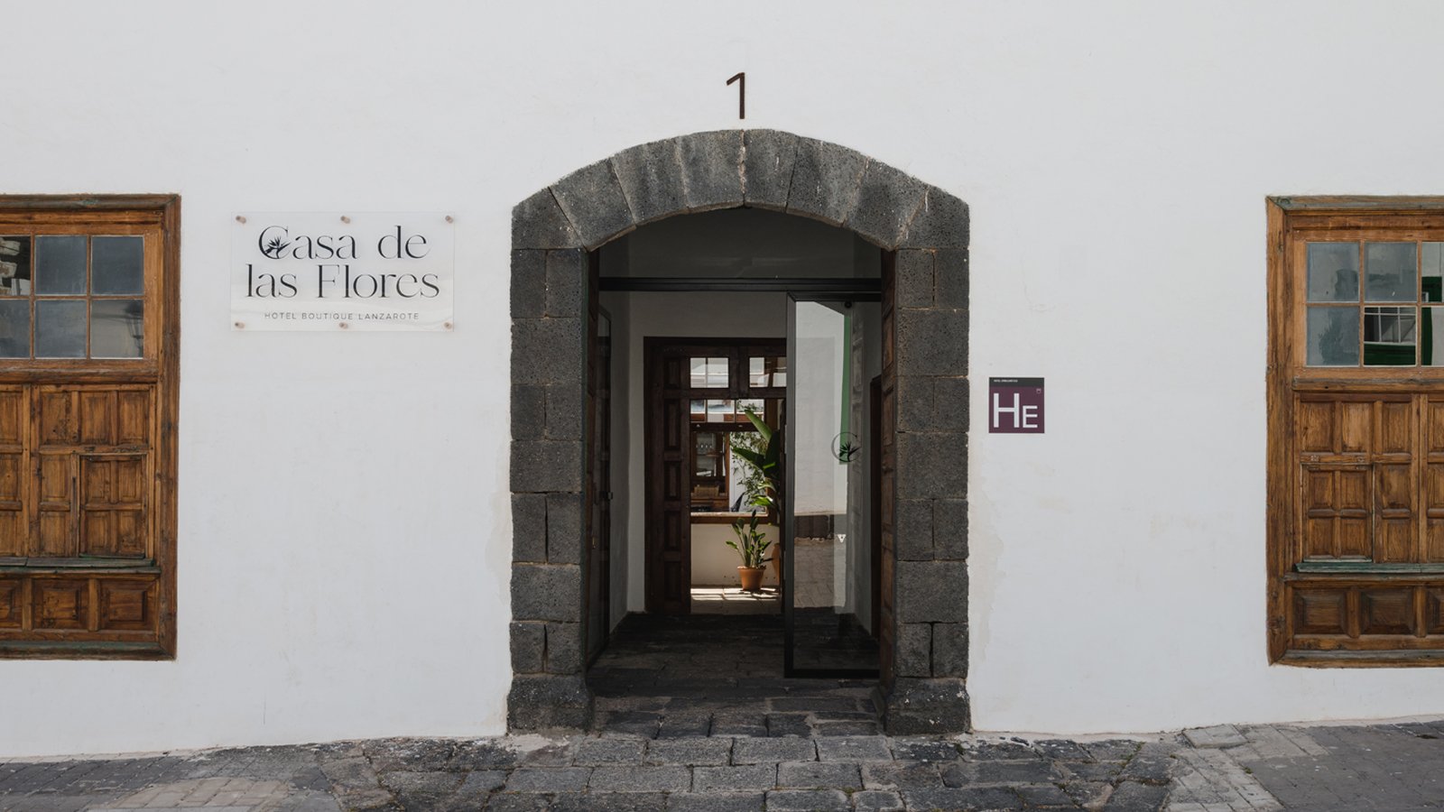
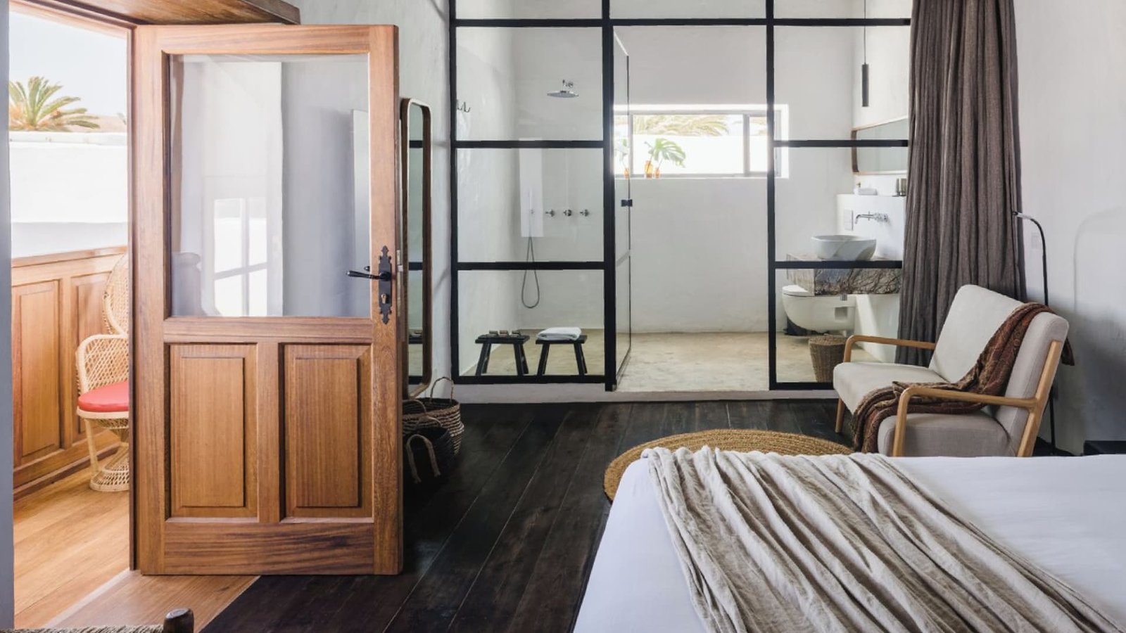
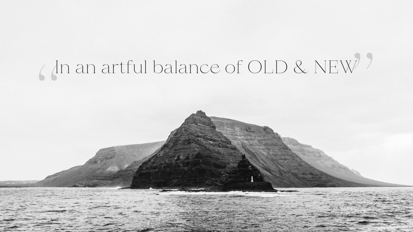
The challenge was to develop a brand identity that captures the essence of Lanzarote and reflects the owners' unique vision, bringing together traditional Canarian architecture and contemporary art to create a singular space.
The Solution
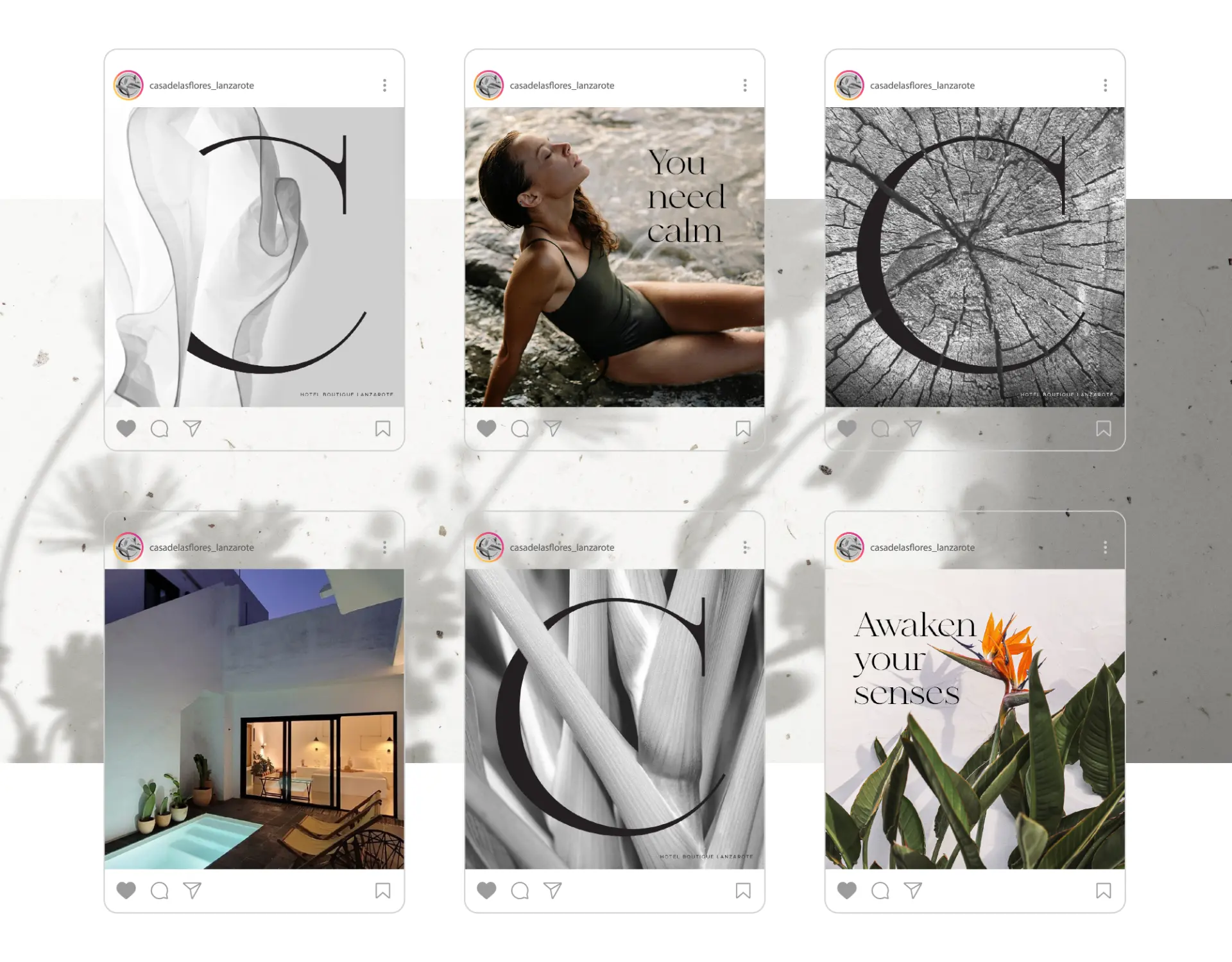
The identity visually incorporates the story of Casa de las Flores.
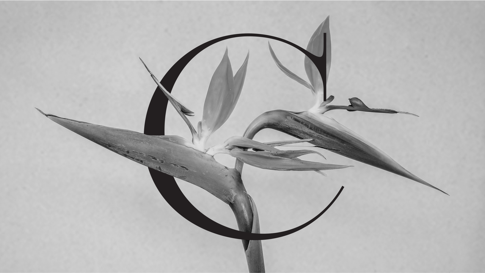
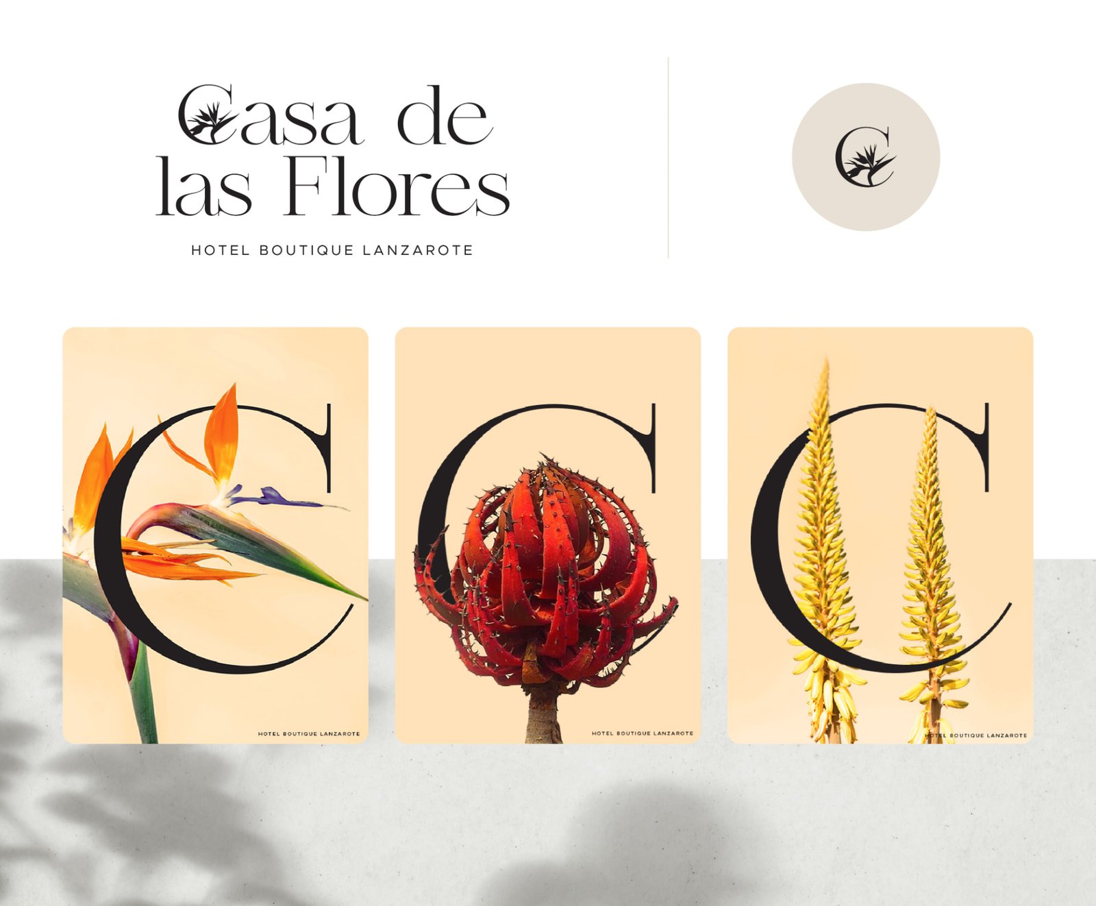
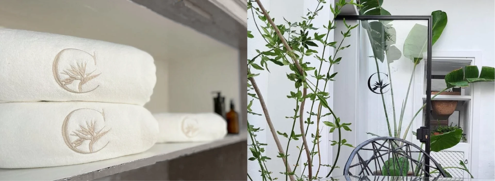
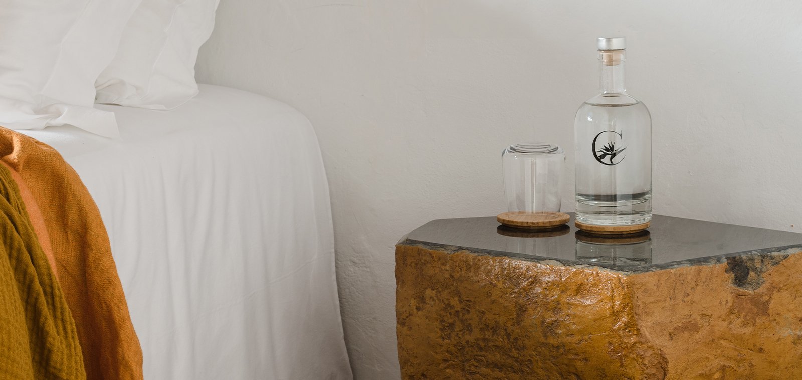
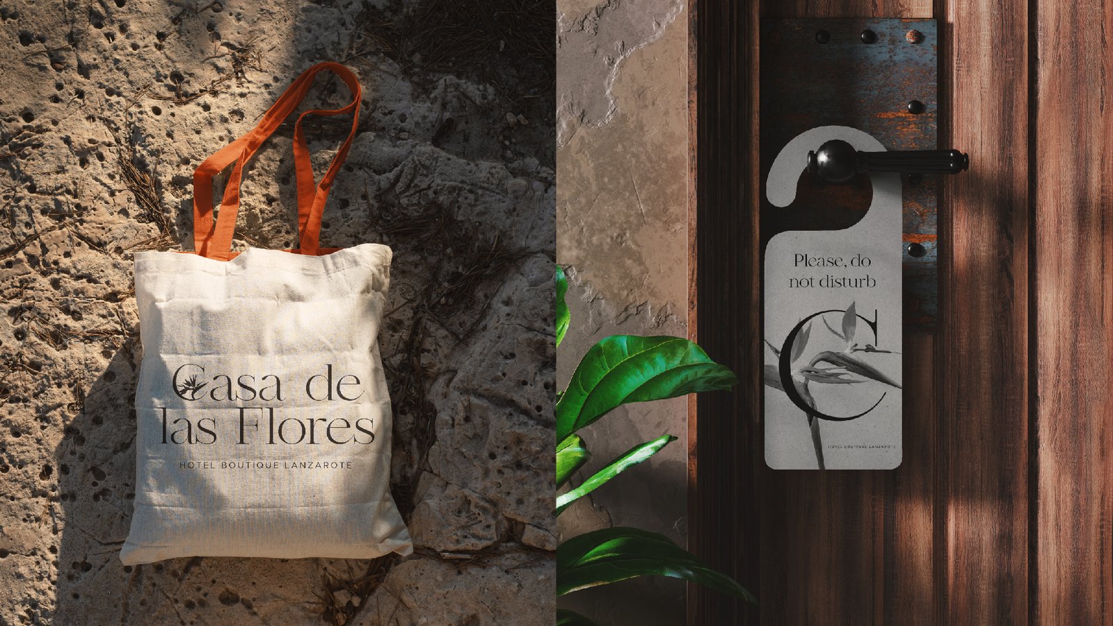
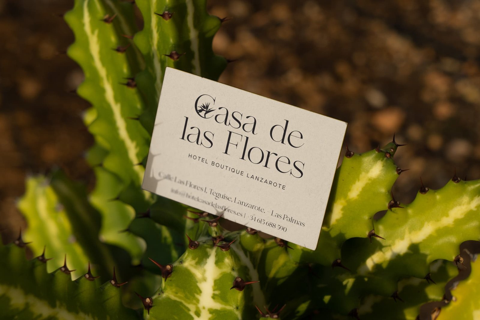
The Bird of Paradise, a distinctive flower found in Lanzarote, became the central symbol, representing the flowers that give the hotel its name.
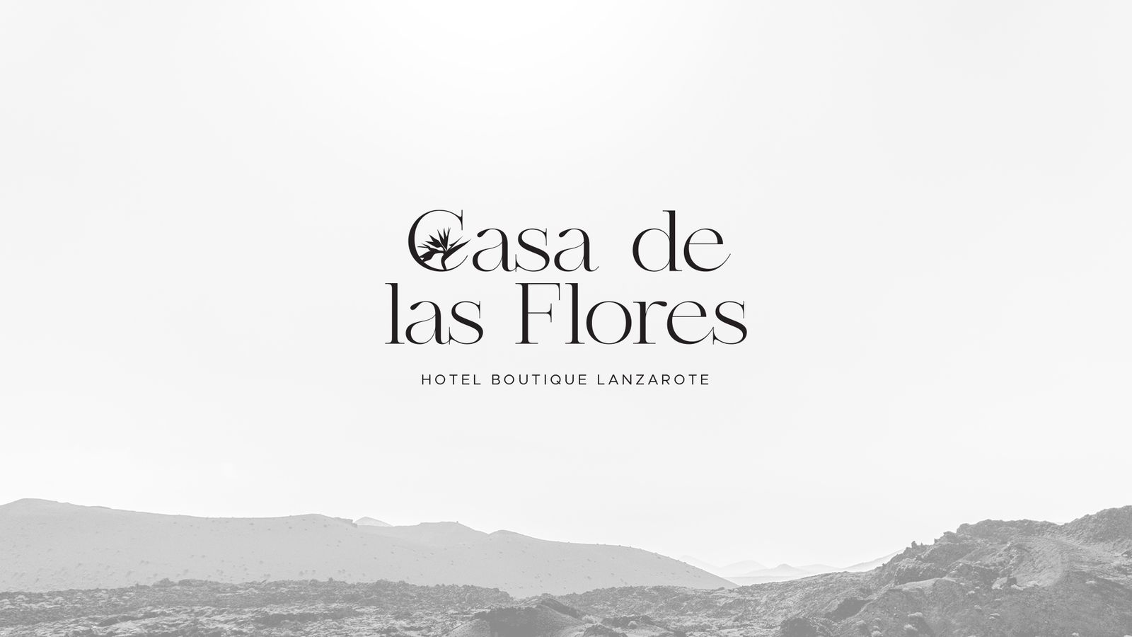
Serif typography plays a key role in bringing together the traditional and contemporary sides of the project, adding a classic character while introducing custom details within the logotype.
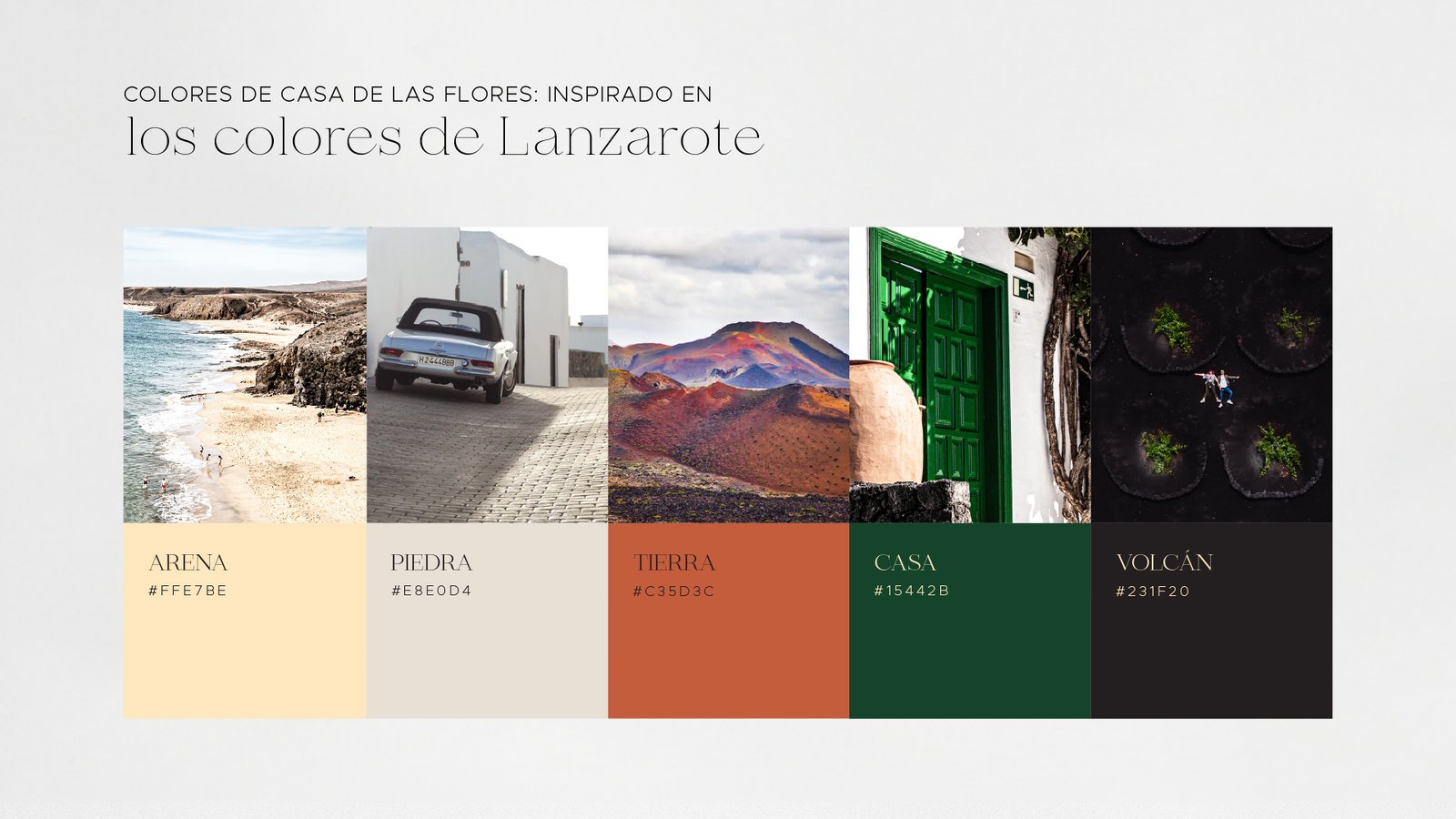
The visual identity was built around the colours of the island, local flora and carefully selected photography to communicate the main elements behind the brand.


Have a project in mind?
Madrid · Worldwide · English / Spanish